Why?
The current logo has a long history, and is well recognized, but the design is essentially 15 years old. There have been comments on the mailing list that the brand should be updated. The logo also has a lot of colors which makes printing and embroidery more expensive, and sometimes leads into color matching issues as well.
CentOS project has also grown to be more than just a Linux distribution. The Special Interest Groups, CentOS Stream, and other sub-projects could also use a related logo, and we thought it would be a good time to update the branding to reflect that.
As CentOS Stream needed some kind of a logo, we had the Red Hat brand team create some proposed logos for Stream announcement. At the same time we started to feel that it was the right time to refresh the logo and branding as well, and that the process should happen openly in the community.
How?
We shared the Stream logo design files with the centos-devel list in November, which started a good collaboration with me and Alain (who has been doing great work on the current logo and brand style wiki pages) and we quickly realized, that we need to take the design idea brainstorming away from the developers mailing list to avoid spamming everyone with attachments (or risking possible broken links to images late in the list archives) - so we started a discussion in the CentOS Artwork issue tracker.
This lead to a lively and active collaboration, and we attracted also brokenkeyframe to contribute. We went through several ideas, some better than others, and settled into a stylized version of the original chaos symbol of the CentOS logo, which keeps the history alive, while making it more modern.

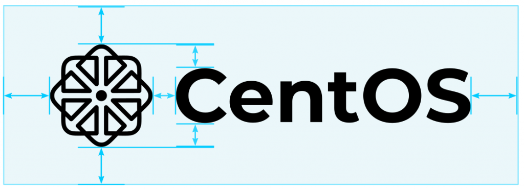
The logo is a single color, which makes it easy for embroidery for example, but also lets us have the logo with a photo or texture as background. The corners of the chaos symbol are slightly rounded to give it a modern touch, and we also updated the font to match the style of the symbol.
The font is called Montserrat, originally created by Julieta Ulanovsky, a designer from Argentina. Montserrat is an effort to celebrate and preserve the historic signs and lettering found in the Montserrat neighborhood of Buenos Aires. Montserrat is a beautiful typeface with several variants, and it is licensed with the libre SIL Open Font License. Julieta had a successful Kickstarter project to fund the development, and since then the project has been updated and extended by a community of collaborators. The Kickstarter page has a nice video introduction, if you are interested in typography or inspiration behind the project.
We also thought about sub-project logos (Stream, the distro itself, various Special Interest Groups) and worked on a logo template system for those.

The work will be presented to the CentOS governing board soon, but we wanted to share our current progress (and the path that lead to it) with all of you. It is likely that not so many of you have actively followed our progress on the issue tracker.
We will announce this blog post also on the CentOS developers mailing list, and I encourage you to share your feedback there, instead of commenting on this post, or on the above git issue, which we wish to keep on the topic of design, so we can focus on the task better. We’ll be sure to read your comments on the mailing list and take them to heart.
Also, I want to thank everyone who contributed and shared their thoughts and feedback!
New logo is very nice. Hayırlı olsun.
I really really like it! Please make it happen 🙂
The new logo is simply too restless. I can understand that you don't want to break with the old symbolism completely, but that's just how it looks.
Make a competition within the community or on a portal. That way the whole world has the opportunity to create a common brand that everyone will love.
New logo looks clean / nice. Refresh! 🙂
I think this is a huge step up from the previous one. I can't imagine any designer had actually put work into the original. However, I do think it's still quite busy. But then again, I'm also of the opinion that the CentOS name needs a re-haul as well. It is now much more of an official part of the Red Hat family, so something along the lines of "Fedora" and "Red Hat" would be appropriate.
Comments are closed.